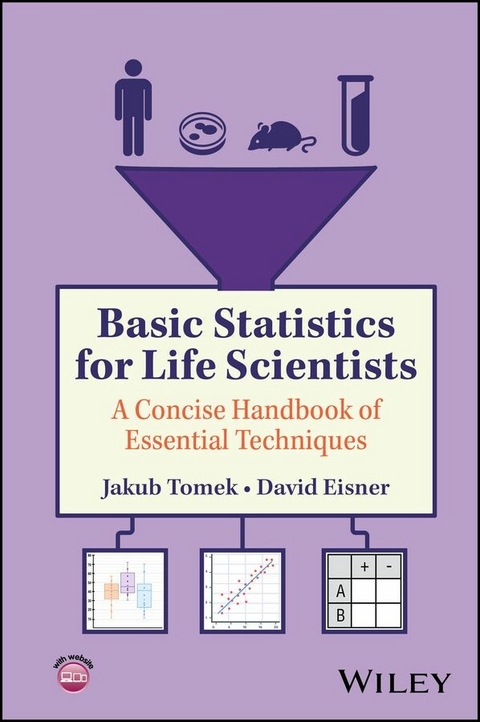
Basic Statistics for Life Scientists (eBook)
645 Seiten
Wiley (Verlag)
978-1-394-28497-9 (ISBN)
Concise and approachable yet rigorous discussion of the appropriate use of statistical techniques in life science research
Basic Statistics for Life Scientists is an approachable, concise handbook of essential statistical techniques that teaches correct practice in the life sciences and related fields, helping readers become competent users of statistics and assisting them in identifying the best statistical method for their research question while also being aware of its strengths and limitations. The book is supported by illustrations and real-world examples explaining how to apply the techniques using statistical software tools.
Written by two highly qualified authors, Basic Statistics for Life Scientists includes information on:
- Appropriate statistical techniques for evaluating experimental data, avoiding excessive jargon or mathematics
- Misuse of statistical techniques in life sciences research
- Systematic problems present in life sciences research, such as multiple hypothesis testing and pseudoreplication
- Experimental design and the problems associated with the concept of binary statistical significance
Basic Statistics for Life Scientists is an essential reference for students and researchers in life sciences and biomedicine, especially PhD students and postdoctoral researchers, seeking to confidently apply appropriate statistical tests to their data. The book is also valuable to advanced undergraduates and more senior researchers in related fields.
Jakub Tomek is a Sir Henry Wellcome Fellow in the Department of Physiology, Anatomy and Genetics at the University of Oxford.
David Eisner is the Professor of Cardiac Physiology at the University of Manchester. He has served as Editor-in-Chief of The Journal of Molecular and Cellular Cardiology and The Journal of Physiology and is currently Editor-in-Chief of The Journal of General Physiology.
Concise and approachable yet rigorous discussion of the appropriate use of statistical techniques in life science research Basic Statistics for Life Scientists is an approachable, concise handbook of essential statistical techniques that teaches correct practice in the life sciences and related fields, helping readers become competent users of statistics and assisting them in identifying the best statistical method for their research question while also being aware of its strengths and limitations. The book is supported by illustrations and real-world examples explaining how to apply the techniques using statistical software tools. Written by two highly qualified authors, Basic Statistics for Life Scientists includes information on: Appropriate statistical techniques for evaluating experimental data, avoiding excessive jargon or mathematicsMisuse of statistical techniques in life sciences researchSystematic problems present in life sciences research, such as multiple hypothesis testing and pseudoreplicationExperimental design and the problems associated with the concept of binary statistical significance Basic Statistics for Life Scientists is an essential reference for students and researchers in life sciences and biomedicine, especially PhD students and postdoctoral researchers, seeking to confidently apply appropriate statistical tests to their data. The book is also valuable to advanced undergraduates and more senior researchers in related fields.
1
A Primer on Data Summarization and Visualization
The first step of data analysis should be summarization and visualization of your data. It allows you and your readers to see trends and relationships in the data that would be easy to miss just looking at raw numbers. It may also inform your selection of a statistical approach to the analysis. In this section, we provide a quick overview of key data summary and visualization techniques that we also use throughout the book.
1.1 Numerical Summary of Data
When we have numerical data (blood pressure, weight, test score, etc.), the numerical summary we are often interested in is the central tendency. This is the value around which the data are clustered, i.e., what are representative or typical data? The most often used one is the mean – the average value (sum of all the measurements divided by the number of measurements). This is a good descriptor of your data, if they are symmetrical and they are clustered mainly around the mean, such as diastolic blood pressure (Figure 1.1A).
As well as knowing the mean value of your data, it is often important to know how widely they are spread, i.e., how much they differ from the mean. Particularly in the setting of symmetric bell‐shaped data such as in Figure 1.1A, a good and common description is the standard deviation, which is related to how far the data points are from the mean1 (Figure 1.1A). The greater the standard deviation, the wider the spread from the mean.
Figure 1.1 Numerical summary of data. The three panels show histograms of the underlying data, aggregating the numbers in certain value ranges and showing how many data points fall within each bin. This provides a quick summary of the overall shape of the data. (A) Histogram of diastolic blood pressure measurements in a population of patients along with visualization of the mean and horizontal ‘whiskers’ extending to ± one standard deviation. (B) Histogram of a blood biomarker in patients. The values of this biomarker are typically relatively low but can reach very large values in the setting of a diseased heart. The horizontal lines compare two numerical summaries of central tendency and spread: mean and standard deviation versus median and interquartile range. The mean and standard deviation describe the data poorly for several reasons. First, the high values drag the mean to a value that is high and not typical of the data (around 78% of the measurements are below the mean). Second, the asymmetry together with presence of the high values leads to a very high standard deviation which reaches below zero, where no measurements can physically occur. In contrast, the median corresponds to a typical value in the data and the interquartile range gives a quick overview of where most of the data lie. (C) Histogram of arrival times at a restaurant. Both mean and median fail to describe bimodal data, such as describing when people arrive. Likewise, neither the standard deviation nor the interquartile range are useful for such ‘mixed’ data. Data used in the figure were generated artificially to mimic possible real‐world distribution.
However, a mean and standard deviation are not well suited for describing data that are heavily skewed (leaning to one side) such as the data of Figure 1.1B, where there are many points with high values which make the mean a poor descriptor of the whole data set. Imagine a company with nine employees who each earn 30,000 EUR per year and a single one (perhaps a manager) who earns 100,000 EUR per year. The mean salary is 37,000 EUR per year, but this does not really represent the overall salary situation well, as 90% of employees earn substantially less than the mean. In addition, if the manager's pay is increased to 200,000 EUR, the mean salary in the company increases by 10,000 EUR, yet the salary of most employees does not change.
A measure of central tendency which is usually better‐suited for describing asymmetrical data is the median. This is the middle value present in the data after they are sorted2 (i.e., the value separating the higher half of data values from the lower half). For the salary example above, the median will be 30,000 EUR and will be unaffected by the manager's pay rise. The median is less sensitive than the mean to skewness and presence of extreme points, giving a more representative idea of such data. An example for data describing a blood biomarker is given in Figure 1.1B, illustrating how the median better illustrates where most data are.
To characterize the spread of skewed data, the interquartile range is typically preferred to standard deviation, as it gives a better representation of the asymmetricity when the interval is visualized and/or its boundaries are reported (Figure 1.1B). Similarly to a median, it is based on the order of the data. A x‐percentile of your data is the value so that x % of your data are below this (the median is thus a special case, a 50‐percentile). The interquartile range lies between the 25‐percentile3 and 75‐percentile (Figure 1.1B). Here the distance from the median to the 75th percentile is greater than to the 25th, indicating marked skewness.
That said, there are certain examples of data where neither mean nor median provides a representative description. One example is the distribution of times when guests arrive at restaurants (Figure 1.1C): most arrive around noon or around 8 p.m., but the mean and median are both around 4 p.m., when almost nobody arrives. Such data are termed bimodal (having two peaks) and are not well‐described by the mean or the median (and the spread is not well‐described by either standard deviation or interquartile range). They can arise in biological data, e.g., when the study population contains two distinct subpopulations, such as two sexes, different animal strains, and so on. Such data need to be handled on a case‐by‐case basis, and in some cases, it may be most practical to study the subgroups separately.
Figure 1.2 Visual summary of data. (A) Summarizing data with a mean (diamond) and ± standard deviation (whiskers). (B) A similar summary using bar graphs, this time without showing the underlying data. (C) A problematic use of bar graph showing mean and standard deviation, which do not represent the underlying skewed data well. Grey points show the underlying data – the bar graph here is problematic particularly if the underlying data are not shown. You can notice the asymmetry in that no values lie below the bottom whiskers, whereas numerous points reach above the top whisker. (D) Boxplots more appropriately representing the same skewed data. (E) A problematic use of boxplot for bimodal data. (F) Violin plot representing well the underlying bimodal data.
At the end of the day, the choice of which data parameter to use depends on the research question. The above are only suggestions, and the mean may still be useful even for describing skewed data in certain cases, such as when your scientific hypothesis is specifically about change in mean.
Code samples for this section (at the end of the book) show how to calculate mean, median, standard deviation and interquartile range in the R software.
1.2 Data Visualization
Figure 1.1 shows one example of visualization, the histogram. This is certainly a good way of looking at your data, but particularly when you want to compare two or more groups of data, other ways of data visualization can be more useful.
When the data are well‐described by mean and standard deviation (i.e., the data are symmetric around the mean and most points are close to the mean), you can simply plot the mean and standard deviation for the groups. Figure 1.2A shows the weight of rats of two different strains (A and B), 30 rats in each group, with black diamonds and whiskers showing the mean ± standard deviation. You will also often encounter in the literature the standard error of mean being used to show data spread. However, it is not a good indicator for this purpose and should not be used as such – you can find more detail on this in Box 1.1. Be aware of this issue when reading articles and do check, whether the error bars presented are standard deviation or standard error of mean.
Box 1.1 What is the Standard Error of the Mean (S.E.M.)?
In many articles, the error bars correspond to ‘S.E.M.’ instead of the standard deviation. In general, do not use S.E.M. unless you have a clear rationale. S.E.M. is defined as the standard deviation (S.D.) divided by the square root of the number of measurements. Therefore, the greater the number of points, the smaller is the S.E.M. for a given standard deviation. For example, with 4 points, the S.E.M. is 0.5 of the S.D., whereas with 20, it is 0.22 of the S.D. The standard deviation and S.E.M. also have a different interpretation. While the standard deviation is a description of data spread, S.E.M. is instead a measure of confidence in the estimate of the mean. This can be illustrated using the following plot, where a standard deviation and S.E.M. are calculated from 10, 100, and 1000 data points generated from...
| Erscheint lt. Verlag | 13.10.2025 |
|---|---|
| Sprache | englisch |
| Themenwelt | Mathematik / Informatik ► Mathematik ► Statistik |
| Mathematik / Informatik ► Mathematik ► Wahrscheinlichkeit / Kombinatorik | |
| Schlagworte | life science analysis • life science anova • life science experimental design • life science hypothesis • life science methods • life science pseudoreplication • Life Science Research • life science software • life science statistics |
| ISBN-10 | 1-394-28497-7 / 1394284977 |
| ISBN-13 | 978-1-394-28497-9 / 9781394284979 |
| Informationen gemäß Produktsicherheitsverordnung (GPSR) | |
| Haben Sie eine Frage zum Produkt? |
Kopierschutz: Adobe-DRM
Adobe-DRM ist ein Kopierschutz, der das eBook vor Mißbrauch schützen soll. Dabei wird das eBook bereits beim Download auf Ihre persönliche Adobe-ID autorisiert. Lesen können Sie das eBook dann nur auf den Geräten, welche ebenfalls auf Ihre Adobe-ID registriert sind.
Details zum Adobe-DRM
Dateiformat: EPUB (Electronic Publication)
EPUB ist ein offener Standard für eBooks und eignet sich besonders zur Darstellung von Belletristik und Sachbüchern. Der Fließtext wird dynamisch an die Display- und Schriftgröße angepasst. Auch für mobile Lesegeräte ist EPUB daher gut geeignet.
Systemvoraussetzungen:
PC/Mac: Mit einem PC oder Mac können Sie dieses eBook lesen. Sie benötigen eine
eReader: Dieses eBook kann mit (fast) allen eBook-Readern gelesen werden. Mit dem amazon-Kindle ist es aber nicht kompatibel.
Smartphone/Tablet: Egal ob Apple oder Android, dieses eBook können Sie lesen. Sie benötigen eine
Geräteliste und zusätzliche Hinweise
Buying eBooks from abroad
For tax law reasons we can sell eBooks just within Germany and Switzerland. Regrettably we cannot fulfill eBook-orders from other countries.
aus dem Bereich


