A clear easy-to-read guide to presenting your message using statistical data
Poor presentation of data is everywhere; basic principles are forgotten or ignored. As a result, audiences are presented with confusing tables and charts that do not make immediate sense. This book is intended to be read by all who present data in any form.
The author, a chartered statistician who has run many courses on the subject of data presentation, presents numerous examples alongside an explanation of how improvements can be made and basic principles to adopt. He advocates following four key 'C' words in all messages: Clear, Concise, Correct and Consistent. Following the principles in the book will lead to clearer, simpler and easier to understand messages which can then be assimilated faster. Anyone from student to researcher, journalist to policy adviser, charity worker to government statistician, will benefit from reading this book. More importantly, it will also benefit the recipients of the presented data.
'Ed Swires-Hennessy, a recognised expert in the presentation of statistics, explains and clearly describes a set of 'principles' of clear and objective statistical communication. This book should be required reading for all those who present statistics.'
Richard Laux, UK Statistics Authority
'I think this is a fantastic book and hope everyone who presents data or statistics makes time to read it first.'
David Marder, Chief Media Adviser, Office for National Statistics, UK
'Ed's book makes his tried-and-tested material widely available to anyone concerned with understanding and presenting data. It is full of interesting insights, is highly practical and packed with sensible suggestions and nice ideas that you immediately want to try out.'
Dr Shirley Coleman, Principal Statistician, Industrial Statistics Research Unit, School of Mathematics and Statistics, Newcastle University, UK
Ed Swires-Hennessy, Statistical Consultant, UK
Ed Swires-Hennessy was a government statistician until his retirement in 2010. His teaching on statistical presentation has continued and he currently delivers a one day course on Presenting Data for the Royal Statistical Society (RSS). In 2003 he was awarded the RSS JH West medal for outstanding contribution and influence on the dissemination of official statistics.
A clear easy-to-read guide to presenting your message using statistical data Poor presentation of data is everywhere; basic principles are forgotten or ignored. As a result, audiences are presented with confusing tables and charts that do not make immediate sense. This book is intended to be read by all who present data in any form. The author, a chartered statistician who has run many courses on the subject of data presentation, presents numerous examples alongside an explanation of how improvements can be made and basic principles to adopt. He advocates following four key C words in all messages: Clear, Concise, Correct and Consistent. Following the principles in the book will lead to clearer, simpler and easier to understand messages which can then be assimilated faster. Anyone from student to researcher, journalist to policy adviser, charity worker to government statistician, will benefit from reading this book. More importantly, it will also benefit the recipients of the presented data. Ed Swires-Hennessy, a recognised expert in the presentation of statistics, explains and clearly describes a set of principles of clear and objective statistical communication. This book should be required reading for all those who present statistics. Richard Laux, UK Statistics Authority I think this is a fantastic book and hope everyone who presents data or statistics makes time to read it first. David Marder, Chief Media Adviser, Office for National Statistics, UK Ed s book makes his tried-and-tested material widely available to anyone concerned with understanding and presenting data. It is full of interesting insights, is highly practical and packed with sensible suggestions and nice ideas that you immediately want to try out. Dr Shirley Coleman, Principal Statistician, Industrial Statistics Research Unit, School of Mathematics and Statistics, Newcastle University, UK
Ed Swires-Hennessy, Statistical Consultant, UK Ed Swires-Hennessy was a government statistician until his retirement in 2010. His teaching on statistical presentation has continued and he currently delivers a one day course on Presenting Data for the Royal Statistical Society (RSS). In 2003 he was awarded the RSS JH West medal for outstanding contribution and influence on the dissemination of official statistics.
List of Tables vii
List of Figures ix
Introduction xiii
Preface xvii
Acknowledgements xix
1 Understanding number 1
1.1 Thousands separator 2
1.2 Decimal separator 3
1.3 Level of detail in comparisons 4
1.4 Justification of data 5
1.5 Basic rounding 7
1.6 Effective rounding 9
Notes 16
2 Tables 17
2.1 Position of totals in tables 17
2.2 What is a table? 19
2.3 Reference tables 19
2.4 Summary tables 22
2.5 How tables are read 24
2.6 Layout of data in tables 25
2.7 Capital letters for table titles and headings in tables 29
2.8 Use of bold typeface 30
2.9 Use of gridlines and other lines in tables 30
Notes 31
3 Charts (bar charts, histograms, pie charts, graphs) 33
3.1 How the user interprets charts 33
3.2 Written aims for charts 35
3.3 Scale definition and display 37
3.4 Difference between bar charts and histograms 49
3.5 Pie chart principles 51
3.6 Issues with pie charts 55
3.7 Graph principles 63
3.8 Issues with graphs 64
3.9 Pictogram principles 79
3.10 Comparative charts: Multiple pies, multiple bar charts, double scale graphs 82
3.11 Graphics 88
3.12 Three-dimensional charts 90
Notes 92
4 Numbers in text 93
4.1 Numbers written as text 94
4.1.1 Correct numbers 94
4.1.2 Clear numbers 94
4.1.3 Concise numbers 95
4.1.4 Consistent numbers 96
4.2 Ordering of data 97
4.3 Technical terms 98
4.4 Plain language 100
4.5 Emotive language 102
4.6 Key messages 103
Notes 105
5 Data presentation on the Internet 107
5.1 The early years 110
5.2 Statistics on CD-ROMs 113
5.3 Data on the Internet 116
5.4 Charts on the Internet 120
5.5 Text on the Internet 128
Notes 130
?Highly recommended to a very wide audience.? (Mathematical Association of America, 1 January 2015)
?Presenting data is, of course, more than a good table or an informative graphic. The words that describe the data must also be correct, clear, concise and consistent, and the author devotes a chapter to ensuring that the expert?s hard work is not undone by commentary that is too technical or too laboured to be understood by non-expert audiences.? (The Royal Statistical Society, 1 February 2015)
?This book must be mandatory to any data analyst and statistician, and indeed anyone who presents numeric data. The word "numeric" is important, as non-numeric data are not discussed in the book.? (ENBIS News, 10 December 2014)
?The words that describe the data, and the messages it may have, must also be correct, clear, concise and consistent, and the author devotes a chapter to ensuring that the expert?s hard work is not undone by commentary that is too technical or too laboured to be understood by non-expert audiences.? (Significance, 1 February 2014)
"The book is easy to read and can be consumed
in a single train journey. It is also easy to look at
and the illustrations and graphics occupy as much space
as the text. The author has indeed put his money where
his mouth is and the graphics both illustrate his points
and makes them alone. The highlight for me was in the
chapter on tables where the author reduces a table containing
seven columns and five rows to a two by two table
which beautifully makes the point when previously it had
been lost in a forest of figures...
This is
an excellent book and I would recommend it as essential
reading to anyone who is writing a thesis or dissertation,
making a presentation or writing a paper. That?s all of us." (Occupational Medicine, 15th February 2016)
Chapter 1
Understanding number
This chapter deals with the basics of how users perceive numbers and how they should be presented to allow maximum uptake of the meaning of the data.
A false assumption of many who seek to communicate numerical information is that their audience is as able to handle the information as they are. The available data in for the majority of OECD countries is that numeracy skills are significantly below those for literacy.
Numeracy skills in the general population in England are poor – and are not improving. Information from a skills survey in England in 20111 noted that Numeracy skills had declined slightly since the last survey in 2003. Seventeen million adults in England in 2011 (just under half the working-age population) were at ‘Entry Levels’ in numeracy – roughly equivalent to the standards expected in primary school. Further, the survey showed that 78% of the working-age population were at or below level 2 numeracy. These people may not be able to compare products and services for the best buy, or work out a household budget; essentially they would not achieve a good mark in a mathematics examination at age 16.
More generally, the OECD published the results of a survey in October 20132 showing that 19% of adults in 21 countries had mathematics skills at the level of a 10-year-old. These adults could only manage one-step tasks with sums, sorting numbers or reading graphs: many could only perform sums with money or whole numbers. For individual countries, the percentage at this level of numeracy ranged from 8% in Japan to 32% in Italy. A selection of the results is shown in Figure 1.1. For England and Northern Ireland, the estimate is that around 8.5 million adults are at this level.
Figure 1.1 Adult population with only basic numeracy skills.
1.1 Thousands separator
When considering a number with more than three digits, most of us will not take in the whole number but will try to understand it. If the number is just a set of digits together without any separators, most will try to find the place for thousands separators to form the basis of understanding the number. Then, depending on the size of the number, will try to do some rounding to understand the number and put it into our mental understanding range.
Example 1.1 ............
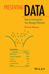
Let us consider a number which represents the population of a country.
How do we try to understand the number? None could honestly say they could read the digits as given and fully understand it without any other process going on in our brains.
So what do we do?
First our brains need a little help. We can introduce separator characters to split the digits into groups of three, starting from the right-hand side. These separators are known as ‘thousands separators’. In some countries (United States and United Kingdom), the separator is a comma; for much of Europe, the separator is a space but in some European countries a full stop is used. I visited one country's statistical office website and found three different practices: comma, space and nothing used for the separator! Whichever is chosen, it must be consistently used throughout an organisation's output.
The number, with these separators would then appear as either
This process here helps us to identify that we have 12 million, 573 thousands and 981 units.
But how does our brain handle all this information? It doesn't. The brain will not retain all of the information but introduce some abbreviation of the data. This could either be by truncating the number (i.e. throwing some digits away): for example, after the millions – giving 12 million. Many will argue that a lot of information has been thrown away: but, does it matter? Only, one could argue, if it affects the understanding. Here the number is actually nearer to 13 millions: so would it be better to think of the number in this way? Truncating is easy but may not always be helpful in aiding our understanding. Without another number to compare this one with, it is probably acceptable.
Another approach would be to round the number. Rounding is the process where we reduce the number of digits and say that the number is ‘nearly’ or ‘about’ something. The difficulty with rounding is that few know how to do it well!
Should the number be rounded to millions? Hundreds of thousands? Or thousands?
Looking independently, just at this one number, most would round the number to 12.6 million. Is this right? It may be. Let us leave the question for a little while.
Principle 1.1: Choose one symbol for the thousands separator and use consistently.
...............
1.2 Decimal separator
Just as differences of symbol exist for thousands separators, some differences exist for the decimal separator. In the United States and the United Kingdom, a full stop is always used as a decimal separator; in Europe, some countries use the full stop and some a comma. Whichever is used, again, it must be consistently used throughout an organisation's output. One example from a national statistical office showed the use of both a comma and a full stop in the same table! An extract of the table is given in Table 1.1. Note also, in this example, that different rounding has been applied to data in lines two to four.
Table 1.1 Different decimal separators used in the same table.
| Basic social indicators |
| Demographic indicators | 1970–75 | 1980–85 | 1993–99 | 2005 |
| Life expectancy at birth (years) | 66.6 | 69.7 | 66.9 | 70.6 |
| Infant mortality (per thousand live births) | 80.8 | 46.8 | 47 | 65,1 |
| Birth rate (per thousand people) | 37 | 40 | 32.6 | 31,4 |
| Death rate (per thousand people) | 8.1 | 7 | 5.3 | 4,4 |
Principle 1.2: Choose one symbol for the decimal separator and use consistently.
1.3 Level of detail in comparisons
In seeking to communicate data, it is important to have the same denomination and rounding of data in any data to be compared. So it is more difficult for the user to compare £1.8 billion of turnover with a profit of £232.9 million: it should be phrased as £1.82 billion of turnover and £0.23 billion of profit. Similarly, comparing profit across years, an increase from £246.4 million to £386 million would be better as ‘an increase from £246 million to £386 million.' An even worse example of presentation would be to compare the number of homes in the stock, 1.8 million, with a new build figure of 9,768 in the last year: this means nothing to most readers and would be better either comparing the number of this year's newly built homes with that of the previous year or noting a percentage increase (though this would be very small).
In Table 1.1, some of the data is given to one decimal place and some to whole numbers. This may be a result of using Excel which would normally drop trailing zeros unless forced to use the same number of decimal places in the data.
In one press release I found the following statement:
- 11.048 million NHS sight tests, an increase of 563 thousand (5.4%) on the previous year.
Here the user is expected to convert the second number to millions. We have spurious accuracy and difficulty in understanding. This would be better as:
- The number of NHS sight tests given increased by 0.6 million (5%) to 11.0 million.
Principle 1.3: Always provide data for comparisons in the same units.
1.4 Justification of data
When we did our first mathematics lessons in school where we had to add numbers of a magnitude over 100, we were taught that we should start by putting three letters in a row as:
These letters represent hundreds, tens and units. We were encouraged to write the numbers neatly in the correct columns below the letters. This places the digits of equal value in the same column.
The use of different typefaces in the preparation of tables is easy today. Personal computers have over a hundred preinstalled typefaces which can be used in basic word processing and spreadsheet packages. Choosing the wrong typeface can interfere with our understanding of the presented data: many examples can be seen in simple tables in magazines or newspapers.
Example 1.2 ............
Consider the following data:
Here, using the Constantia typeface, the proportional spacing for the digits has confounded the positioning of the columns of data. Also here the greater height of the ‘8’ draws attention to them. Why is this important? When asked to identify the largest number in a column of data, we have been taught to look to the left of the column of numbers: the one that is further left (if the data are right justified) is, we believe, the largest number.
This, however, relies on a principle of presentation that more and more people are ignoring. In visits to many official government websites, I can...
| Erscheint lt. Verlag | 5.8.2014 |
|---|---|
| Sprache | englisch |
| Themenwelt | Informatik ► Datenbanken ► Data Warehouse / Data Mining |
| Mathematik / Informatik ► Mathematik ► Statistik | |
| Mathematik / Informatik ► Mathematik ► Wahrscheinlichkeit / Kombinatorik | |
| Naturwissenschaften | |
| Technik | |
| Schlagworte | Audiences • Book • Business & Management • Business Statistics & Math • clear • confusing • Data • easytoread • everywhere • Explanation • Guide • immediate • improvements • Message • Methoden der Daten- u. Stichprobenerhebung • Poor • Präsentationsgraphik • presentation • Principles • Research Methodologies • result • run many courses • Sense • Sociology • Soziologie • Soziologische Forschungsmethoden • Statistical • statistician • Statistics • Statistik • Subject • Survey Research Methods & Sampling • Wirtschaftsmathematik u. -statistik • Wirtschaft u. Management |
| ISBN-13 | 9781118901847 / 9781118901847 |
| Informationen gemäß Produktsicherheitsverordnung (GPSR) | |
| Haben Sie eine Frage zum Produkt? |
Kopierschutz: Adobe-DRM
Adobe-DRM ist ein Kopierschutz, der das eBook vor Mißbrauch schützen soll. Dabei wird das eBook bereits beim Download auf Ihre persönliche Adobe-ID autorisiert. Lesen können Sie das eBook dann nur auf den Geräten, welche ebenfalls auf Ihre Adobe-ID registriert sind.
Details zum Adobe-DRM
Dateiformat: EPUB (Electronic Publication)
EPUB ist ein offener Standard für eBooks und eignet sich besonders zur Darstellung von Belletristik und Sachbüchern. Der Fließtext wird dynamisch an die Display- und Schriftgröße angepasst. Auch für mobile Lesegeräte ist EPUB daher gut geeignet.
Systemvoraussetzungen:
PC/Mac: Mit einem PC oder Mac können Sie dieses eBook lesen. Sie benötigen eine
eReader: Dieses eBook kann mit (fast) allen eBook-Readern gelesen werden. Mit dem amazon-Kindle ist es aber nicht kompatibel.
Smartphone/Tablet: Egal ob Apple oder Android, dieses eBook können Sie lesen. Sie benötigen eine
Geräteliste und zusätzliche Hinweise
Buying eBooks from abroad
For tax law reasons we can sell eBooks just within Germany and Switzerland. Regrettably we cannot fulfill eBook-orders from other countries.
aus dem Bereich