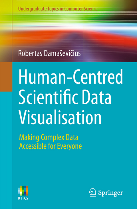
Human-Centred Scientific Data Visualisation
Springer International Publishing (Verlag)
978-3-032-01605-8 (ISBN)
- Noch nicht erschienen - erscheint am 04.02.2026
- Versandkostenfrei
- Auch auf Rechnung
- Artikel merken
This textbook is a practical guide for researchers, educators, data analysts, and user experience (UX) designers who seek to transform raw, complex datasets into clear, accessible, and engaging visual narratives. Covering a wide range of chart types including line plots, bar charts, box plots, scatterplots, histograms, pie and donut charts, spider plots, ridgeline plots, density plots, and advanced visualizations like treemaps, network graphs, and Sankey diagrams, it blends visualization theory with hands-on implementation in Python and R.
Combining the rigor of scientific communication with the principles of UX design, it offers practical techniques, real-world examples, and hands-on coding strategies in Python and R to create data visualizations that speak to both experts and non-experts. Whether you're visualizing data for policymakers, stakeholders, or the public, this book empowers you to build informative and aesthetically compelling visualizations that make data not only visible, but truly understandable.
Robertas Dama evicius is a professor at the Department of Software Engineering, Kaunas University of Technology, Kaunas, Lithuania. With extensive expertise in artificial intelligence, scientific visualization, software engineering, and educational technologies, he has authored numerous high-impact research articles and book chapters. He actively supervises doctoral students, evaluates EU-funded projects, and serves on editorial boards of several international journals. Known for his interdisciplinary approach, he combines technical depth with a human-centered perspective to make complex concepts accessible to diverse audiences. This book reflects his commitment to bridging research and real-world applications through engaging storytelling and practical insight in data visualization.
Importance of Accessibility and Inclusivity in Visualizing Scientific Data.- Designing Marvelous Line Plots.- Designing Stunning Bar Charts.- Designing Amazing Scatterplots.- Designing Effective Histograms.- Designing Astonishing Pie Charts.- Creating Enchanting Spider Plots.- Creating Vibrant Ridgeline Plots.- Creating Breathtaking Density Plots.- Designing Other Beautiful Charts.- Advanced Visualization Techniques.
| Erscheinungsdatum | 29.11.2025 |
|---|---|
| Reihe/Serie | Undergraduate Topics in Computer Science |
| Zusatzinfo | X, 422 p. 83 illus. in color. |
| Verlagsort | Cham |
| Sprache | englisch |
| Maße | 155 x 235 mm |
| Themenwelt | Mathematik / Informatik ► Informatik ► Betriebssysteme / Server |
| Informatik ► Software Entwicklung ► User Interfaces (HCI) | |
| Schlagworte | Creating Accessible Visualizations • data patterns • Data Visualization • Digital Data Exploration • Visualization Design |
| ISBN-10 | 3-032-01605-3 / 3032016053 |
| ISBN-13 | 978-3-032-01605-8 / 9783032016058 |
| Zustand | Neuware |
| Informationen gemäß Produktsicherheitsverordnung (GPSR) | |
| Haben Sie eine Frage zum Produkt? |
aus dem Bereich


