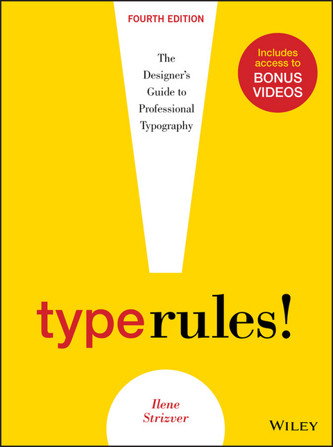
Type Rules (eBook)
John Wiley & Sons (Verlag)
978-1-118-75866-3 (ISBN)
Type Rules!, Fourth Edition is an up-to-date, thorough introduction to the principles and practices of typography. From the fundamentals to cutting-edge applications, this edition has everything today's serious designer needs to use type effectively. Dozens of exercises reinforce authoritative coverage on such topics as how to select the appropriate type for the job, how to set type like a pro, and how to design a typeface, as well as how to fully harness the power of major design packages including the Adobe Creative Suite.Includes video clips showing examples of projects discussed in Chapter 11- Type on the Web and Chapter 12- Type in Motion
Ilene Strizver is the founder of The Type Studio in Westport, Connecticut. She writes and teaches extensively on typography. During her career, she has been creative and produc- tion director of U&lc magazine, as well as director of typeface development at International Typeface Corporation (ITC) in New York City, where she developed more than 300 text and display typefaces with respected type designers such as Sumner Stone, Erik Spiekermann, Jill Bell, Jim Parkinson, and the late Phill Grimshaw. In addition to penning the popular TypeTalk column for creativepro.com, Ilene is a featured contributor to the Fontology series for fonts.com.
Ilene Strizver is the founder of The Type Studio in Westport, Connecticut. She writes and teaches extensively on typography. During her career, she has been creative and produc- tion director of U&lc magazine, as well as director of typeface development at International Typeface Corporation (ITC) in New York City, where she developed more than 300 text and display typefaces with respected type designers such as Sumner Stone, Erik Spiekermann, Jill Bell, Jim Parkinson, and the late Phill Grimshaw. In addition to penning the popular TypeTalk column for creativepro.com, Ilene is a featured contributor to the Fontology series for fonts.com.
CHAPTER TWO
FROM METAL TO MAC:
UNDERSTANDING FONT TECHNOLOGY
Say the word technology to a lot of folks, and they instantly break out in a cold sweat. But to understand type on the computer, why it looks and acts the way it does, and how to make the most of it, it is essential to understand a few things about technology.
The following are a few of the most commonly used (and perhaps abused) terms that will begin to give you an understanding of the basic principles of type and fonts on the computer.
WHAT IS A FONT?
What exactly is a font? The term has changed dramatically since the development of computers. In traditional typography, specifically in days of metal type (or hot type), a font was a collection of metal characters representing the complete character set of a particular design (all the characters, numerals, signs, symbols, etc.), all of the same weight, style, and size. Ten point, twelve point, and any other size of the same design were each separate fonts.
Today, a font refers to the complete character set of a particular type design or typeface in digital form. Although the term font refers to one weight and style, the font is not size specific as in the days of hot metal. Digital fonts are scalable, that is, size independent; any point-size type can be set from one font. (Fig. 2-1)
Figure 2-1 In the digital world, a font refers to the complete character set of a particular type design or typeface in digital form. This showing of ITC Legacy Serif is a good example of a complete character set, and it displays all the glyphs included in this particular Type 1 font. OpenType fonts often have many more characters than those shown here.
FONT FORMATS
There are currently three font formats to choose from: Type 1, TrueType, and the newest—and most technologically advanced—format, OpenType. If you are a graphic designer, you are most likely familiar with PostScript Type 1 fonts, which, until the development of OpenType, had been the publishing standard since the late 1980s. If you do web design or work with Microsoft Windows software, you might be more familiar with TrueType fonts, which, once again prior to OpenType, were used by Apple and Microsoft for system fonts. The availability of OpenType fonts has added a third format to the mix, one that in recent years has become the gold standard of font formats for most designers.
To understand the differences between Type 1, TrueType, and OpenType fonts, it is necessary to get technical. But don’t worry—you don’t have to commit this information to memory to set good type. Just try to remember the basic principles.
Type 1 (PostScript) Fonts
Type 1 (also known as PostScript Type 1) was developed by Adobe Systems in the mid-1980s. This format is based on a computer language called PostScript, which describes type and graphics in a way that allows for precise, sharp printing at any size.
Type 1 consists of two components: a bitmapped or screen font and a printer or outline font. Both are required to view and to print a font. (The .atm file that accompanies most Type 1 fonts is a text file that stores font metrics, and it is not needed for the functionality of the font.)
Bitmapped or screen fonts. The bitmapped font is responsible for representing the font on your screen. Your screen represents all images—both graphic and type—with small dots or, more accurately, pixels. The typical computer screen has 72 dots per inch, commonly abbreviated as 72 dpi. In a bitmapped font, all the characters are represented as pixels, or bitmaps, so it can be viewed on your screen, thus the term screen font. The relatively low number of dots per inch on your screen (also referred to as screen resolution) compared to your printer makes smaller point sizes increasingly more difficult to display sharply and clearly, giving them the appearance of having more “jaggies” (i.e., jagged edges). This is why text can often be difficult to read on a computer screen. (Fig. 2-2)
Figure 2-2 In a bitmapped font, all the characters are represented as pixels so it can be viewed on your screen. This illustration shows the arrangement of pixels for a character at a particular point size superimposed over the outline.
Printer or outline fonts. This is the part of the font that is necessary to print your work. It is essentially the outline of each character stored as a mathematical description, thus the name outline font. The printer font is scalable, which means it can be enlarged or reduced to just about any size, rendering as crisp and sharp an image as your printer or output device is capable of. Your PostScript printer acts as the brain that makes this interpretation. (This is quite the opposite of the screen font, which is fixed and needs to be generated for each size.) (Fig. 2-3)
Figure 2-3 The image above is a digital representation of an outline. A printer font is scalable, which means it can be enlarged or reduced to any size, rendering as crisp and sharp an image as your printer or output device is capable of printing.
TrueType Fonts
Several years after the development of Type 1 fonts, Apple Computer and Microsoft joined forces to develop TrueType. This format consists of a single file that contains both screen and printer font data. Prior to the development and widespread adaptation of OpenType fonts, TrueType had been most commonly used by Windows users and the nondesign community, with the exception of core TrueType fonts, which were standard on computer operating systems.
TrueType differs from its predecessor mainly, and most importantly, in its expanded hinting capability. Hints are digital instructions built into a font to improve its on-screen and printed appearance, predominantly at small sizes. It is extremely time-consuming and costly to produce a font that features this enhanced clarity—so while some TrueType fonts have it (system fonts, for example), others do not.
OpenType Fonts
OpenType, the newest font format jointly developed by Adobe and Microsoft in the late 1990s, has become the format of choice for graphic designers. It can be described as a superset of Type 1 and TrueType font formats with added enhancements. The features that benefit designers the most are multiplatform support, expanded character sets, and glyph substitution.
Multiplatform support. A font with multiplatform support means that the same OpenType font will run on both a Mac and a Windows machine, as opposed to Type 1 and TrueType fonts, which need to be purchased for either a Mac or a PC. This is a real convenience when your office uses both platforms or you use a PC at work and a Mac at home (or vice versa).
This also means that, with consistent character encoding inherent in multiplatform support, many problems associated with the transferring of documents from Mac to PC (or vice versa) will go away. The most annoying problem is when characters in the original file automatically change to different ones, such as apostrophes and f-ligatures becoming question marks and accented cap Os. No more “search and replace” to correct this irritating problem!
Expanded character sets. OpenType fonts allow type designers and foundries to include thousands of characters in a font—many more than the 256 characters we are used to with Type 1 and TrueType fonts. This means an OpenType font can (but doesn’t necessarily) include true-drawn small caps, oldstyle figures, proportional and tabular figures, extended ligature sets, swash and alternate characters, fractions, dingbats, and symbols, as well as extensive foreign-language support—all in one font. (Fig. 2-4)
Figure 2-4 From the simple to the sublime! Adobe Bickham Script Pro (an OpenType font) comes with a huge selection of swash and alternate characters, enabling a plain vanilla setting to be easily transformed into an elegant, highly embellished showing, previously attainable only from the skillful hands of a calligrapher.
Glyph substitution. This capability goes hand in hand with an expanded character set. OpenType fonts can have a brain and know when to insert situational glyphs, including certain ligatures, swashes, or other special characters. For instance, some swash characters are intended for either the beginning or end of a word to avoid crashing into other letters or creating too much space between two characters. When this feature is turned on in a supporting application, the correct swash will be automatically inserted. If the copy is changed, it will automatically change the swash character back to the standard one as necessary.
Glyph substitution has also been built into some fonts containing several alternates for one character or character combination, so that the font automatically selects characters based on predetermined aesthetic considerations.
It can get a bit more complicated when lots of alternates are available in a font, so be sure that the characters automatically inserted are the ones you want. You might have to manually insert the one you want used, although it is very easy to do this once you become familiar with the process. (Fig. 2-5)
Figure 2-5 House Industries designed Ed Interlock (an OpenType font) with a built-in intelligence to control the use of its hundreds of ligatures in such a way that it “thinks like a designer” and selects the appropriate ligature to maintain balance, particularly in the horizontal strokes. The top...
| Erscheint lt. Verlag | 4.2.2014 |
|---|---|
| Sprache | englisch |
| Themenwelt | Kunst / Musik / Theater ► Design / Innenarchitektur / Mode |
| Informatik ► Grafik / Design ► Desktop Publishing / Typographie | |
| Technik ► Architektur | |
| Schlagworte | Design • Grafikdesign • Graphic Design • Type design, type designer, type designs, types of design, design with type, type and design, type of design, logo ideas, logo fonts, font designs, type of design, Type Rules, Type Rules Fourth Edition |
| ISBN-10 | 1-118-75866-8 / 1118758668 |
| ISBN-13 | 978-1-118-75866-3 / 9781118758663 |
| Informationen gemäß Produktsicherheitsverordnung (GPSR) | |
| Haben Sie eine Frage zum Produkt? |
Kopierschutz: Adobe-DRM
Adobe-DRM ist ein Kopierschutz, der das eBook vor Mißbrauch schützen soll. Dabei wird das eBook bereits beim Download auf Ihre persönliche Adobe-ID autorisiert. Lesen können Sie das eBook dann nur auf den Geräten, welche ebenfalls auf Ihre Adobe-ID registriert sind.
Details zum Adobe-DRM
Dateiformat: EPUB (Electronic Publication)
EPUB ist ein offener Standard für eBooks und eignet sich besonders zur Darstellung von Belletristik und Sachbüchern. Der Fließtext wird dynamisch an die Display- und Schriftgröße angepasst. Auch für mobile Lesegeräte ist EPUB daher gut geeignet.
Systemvoraussetzungen:
PC/Mac: Mit einem PC oder Mac können Sie dieses eBook lesen. Sie benötigen eine
eReader: Dieses eBook kann mit (fast) allen eBook-Readern gelesen werden. Mit dem amazon-Kindle ist es aber nicht kompatibel.
Smartphone/Tablet: Egal ob Apple oder Android, dieses eBook können Sie lesen. Sie benötigen eine
Geräteliste und zusätzliche Hinweise
Buying eBooks from abroad
For tax law reasons we can sell eBooks just within Germany and Switzerland. Regrettably we cannot fulfill eBook-orders from other countries.
aus dem Bereich


